Contemporary print

Marilyn Monroe - Glamour
|
OverviewTitle: Monroe
Size: 473 x 709 pixels Medium: Digital Print Completion: July 2023 Exhibition TextMy piece by the name of, "Monroe," is inspired by the many contemporary prints created by Barbara Kruger. "Monroe," is a digital print with the size, 473 x 709 pixels and was created by utilizing the Photopea Photoshop application. My piece uses the quote, "You deserve better," on a Supreme font and border with a photo of Marilyn Monroe to convey the message, primarily towards women, that there is always a more promising option. What Marilyn Monroe experienced through her lifetime was normalized and is still normalized for women in society today. The hardships of women today needs to be brought to higher attention.
|
inspiration
|

|

|
Barbara Kruger was born in Newark, New Jersey in 1945. Kruger studied at Syracuse University before transferring to New York City's Parsons School of Design, where she trained with artists and photographers Marvin Israel and Diane Arbus. At 22 years old, Kruger began her career in graphic design for Condé Nast Publications at Mademoiselle magazine and was soon promoted to lead designer. Kruger has stated that her biggest influence on her art is connected to her time in graphic design. Kruger began exhibiting her work in New York galleries in the early 1970s. She focused mainly on weaving and painting during the time. However, she believed that her artwork lacked substance, so she took a year-long break from creating art in 1976. She held several teaching roles, including one at the University of California, Berkeley. When she returned to art in 1977, she had shifted away from her previous style and towards picture and text collages. Kruger established her unique style of black-and-white photographs layered with text in 1979. She utilized found photos, contrasting them with short, snappy sentences printed in black, white, or red text bars in Futura Bold or Helvetica Extra Bold typeface. Kruger uses her art to speak in the language of the media and politics: spectacular, powerful, and straightforward. Personal pronouns such as "you" and "I" are common in Kruger's work, drawing the audience into each piece. "Direct address has motored my work from the beginning," Kruger explained. "I like it because it cuts right through the grease." Kruger's many art pieces encourage us to question our own situations, or, as Barbara Krueger herself puts it, "to question and change the systems that contain us." She insists that we analyze how our identities are constructed in society through language and image representation.
planning

|

Marilyn Monroe -Glamour
|

|
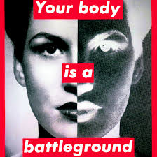
To plan for the creation of my contemporary art piece inspired by Barbara Kruger, I started searching for images on Google. Prior to planning for the piece, I understood that I wanted to use Marilyn Monroe as the focal point image. Similar to Barbara Kruger, I wanted to repurpose a photograph from the past. While I was primarily searching for black-and-white photos, I also looked into the colored photos that I had found of Marilyn Monroe. As I searched for a photograph of Monroe, I wrote down quotes that I believe resembled Barbara Kruger's style in the text boxes that she placed in her contemporary prints. The three primary quotes I wanted to decide from states, "She deserved better," "If she deserved better, so do you," and "You deserve better." The quotes I had created, similar to Barbara Kruger's, relate to feminism and common societal practices. I eventually settled on the final quote, which states, " You deserve better." This specific quote takes heavy inspiration from the many experiences Marilyn Monroe underwent throughout her lifetime (as well as outside of her lifetime). While the events Monroe suffered are not heavily known of, many women, even now, can also relate to her. In the same way that many women have not recieved justice for their experiences, neither did Marilyn Monroe. Ultimately, I had decided on a black and white photograph of Marilyn Monroe, as shown above. I plan on editing the photo, though, to better compare it to the photos that Barbara Kruger commonly uses within her most famous art pieces, such as "I Shop Therefore I Am," "Your Body Is A Battleground," and "Just Be Yourself," which focals a photograph of Paris Hilton and juxtapositions the quote in front of it by hinting at the established norms of appearance within American culture.
process

|

|


|

I began the process of creating my contemporary print by taking a photo of Marilyn Monroe that I had found off of the internet. I opened the Photopea digital photo editing app to begin. In order to make the poster sheet-sized, I made the print approximately 473 by 709 pixels. While the photo was already in black and white, I decided to edit the color of the picture which included exposure, contrast, vibrance, and saturation; all of which I lowered from the original picture. I lowered the exposure of the Monroe photograph to -1.5. I lowered the contrast to -75. I lowered the vibrance to -70. And lastly, I lowered the saturation to -43. I left the temperature and tint of the photograph the same. Next, I went onto the Fontbold.com website to imitate the text shown in Barbara Kruger's work. I decided on the phrase, "You deserve better," and made sure that the font was white and had a red background. I took the photo from the font generator website and brought it into Photopea. I then cropped the photo and pasted it onto the photo of Marilyn Monroe. I decided to place the text on Monroe's neck area. Near the end of the process, I felt that the photo, even after editing, looked too dull and dark. I brightened the areas of Marilyn Monroe's skin and darkened the shadows surrounding her to add more definition.
|
experimentation

|

|

|


|
The experimentation of this project primarily consisted of photo editing within the Photopea application. In the color range section, I took the highlights of the picture and brought its fuzziness up to 90%. To make the photo of Marilyn Monroe look similar to the photographs that Barbara Kruger repurposes and uses in her work, I decided to make the photo darker by adjusting the brightness of the original photo to -33% and moving the contrast of the photo up to 58%. In an effort to further make this photograph of Marilyn Monroe similar to the pictures used by Kruger, I made the photo slightly blurry, giving the photograph an old-timey look that Kruger's works have in common. Additional photo editing was included to ensure the similarity of my artwork to Barbara Kruger's artwork. As stated in the planning section, I had other quotes in my plan to use in front of the photo of Marilyn Monroe. I tested the quotes, "If she deserved better, so do you," and, "She deserved better." I realized that the quote, "If she deserved better, so do you," was a bit too long in comparison to the small quotes and phrases that Kruger often utilizes in her contemporary prints. Both quotes, against the chosen quote, "You deserve better," are not directed toward the audience. The quote, "You deserve better," was the best possible option to ensure a broad similarity between my work and Barbara Kruger's work.
|
critique

|
|
When comparing Barbara Kruger's many works to my piece by the name of, "Monroe," I find many similarities. Barbara Kruger's prints often have a background photo that has been taken and repurposed by its original photographer. The photos she uses are either already in a black-and-white filter or have a filter set on them. The photo I had found of Marilyn Monroe was already in black and white, however, I noticed that the photo was too bright. I dulled down the features of the photo to make it similar to Barbara Kruger's photo style of choice. Kruger also tends to use snappy phrases within her art pieces which works with her chosen photo to add depth to her contemporary prints. The quote I decided on is short and snappy, similar to the quotes Kruger uses. She is also well-known for utilizing, what is now commonly known as, the Supreme font. The font's true name is Futura Heavy Oblique. I made sure to include the Futura Heavy Oblique font within my piece as well as the complete style in which she has her quotes. Her quotes are most commonly lowercased and in italics. The text is in white with the border as a bold red. I noticed that my finished product had a slightly different tone of red than the tone Barbara Kruger uses in her many contemporary prints. The text itself also seems to be thinner than the text used by Barbara Kruger.
Reflection
Given the many ways in which my work and Barbara Kruger's work are comparable, I can genuinely state that I am happy with how this piece turned out. There are many similarities between Barbara Kruger's numerous works and my piece, "Monroe," which I compare. In several of Barbara Kruger's prints, the background image was taken and used again by the original photographer. She either uses pre-existing black-and-white filters on the images or applies filters herself. Although the image of Marilyn Monroe I had obtained was already in black and white, I observed that it was excessively bright. I softened the image's features to make it more reminiscent of Barbara Kruger's preferred photographic aesthetic. Additionally, Kruger often employs sharp language in her artwork, which complements the depth that her chosen photograph gives to her modern prints. The quotation I chose is succinct and to the point, like those Kruger employs. She is renowned for using the Supreme font, which is now widely used. The actual name of the font is Futura Heavy Oblique. I made sure to use the Futura Heavy Oblique typeface and the whole style that she used for her quotes in my piece. Most of her quotes are in italics and lowercase. The border has a bright red color, while the lettering is white. And while the size and boldness of the text and tone of red in the border are slightly different than those used by Barbara Kruger, I believe I successfully created a contemporary print comparable to Kruger.
AcT connection
1.) Clearly explain how you are able to identify the cause-effect relationships between your inspiration and its effect on your artwork:
In my art piece, I made sure that the entire aesthetic matched that of Barbara Kruger's many contemporary prints. I used the same method of repurposing an old black-and-white photo, the same font, and a similar snappy quote to match.
2.) What is the overall approach (point of view) the author (from your research) has regarding the topic of your inspiration?
Barbara Kruger often created her works based around political issues, money, or, similar to my art piece, feminism.
3.) What kind of generalizations and conclusions have you discovered about people, ideas, cultures, etc. while you researched your inspiration?
As Barbara Kruger is considered somewhat of a feminist artist, I have discovered how quick and snappy quotes and bold colors can draw a large amount of attention to, not only the art itself, but the stronger message behind it.
4.) What was the central idea or theme around your inspirational research?
The central theme around my inspiration research was both pop art (, primarily for the color choice), and feminism.
5.) What kind of inferences (conclusions reached on the basis of evidence and reasoning) did you make while reading your research?
I have found, through research, that iconic imaging and a familiar font bring a wide range of attention.
Citations
- “Barbara Kruger.” Barbara Kruger - Bio | The Broad, www.thebroad.org/art/barbara-kruger.
- “Barbara Kruger: Moma.” The Museum of Modern Art, www.moma.org/artists/3266.
- Selvin, Claire. “Barbara Kruger’s Strange, Alluring Text-Based Artworks: How the Artist Critiqued Advertising and Rose to Fame.” ARTnews.Com, 7 Aug. 2020, www.artnews.com/feature/barbara-kruger-art-exhibitions-1202696145/.
